Tag Archives: image decomposition

Fairy lights and decomposing multi-dimensional datasets

A time-lapsed series of photographs showing the sun during the day at North Cape in Norway
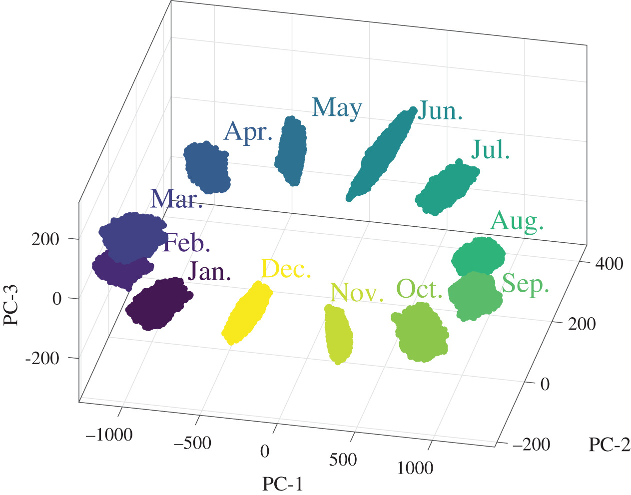
Many years ago, I had a poster that I bought when I visited North Cape in Norway where in summer the sun never sets.  The poster was a time-series of 24 photographs taken at hourly intervals showing the height of the sun in the sky during a summer day at North Cape, similar to the thumbnail.  We can plot the height of the sun as a function of time of day with time on the horizontal axis and height on the vertical axis to obtain a graph that would be a sine wave, part of which is apparent in the thumbnail.  However, the brightness of the sun also appears to vary during the day and so we could also conceive of a graph where the intensity of a line of symbols represented the height of the sun in the sky.  Like a string of fairy lights in which we can control the brightness of each one individually  – we would have a one-dimensional plot instead of a two-dimensional one.  If we had a flat surface covered with an array of lights – a chessboard with a fairy light in each square – then we could represent three-dimensional data, for instance the distribution of elevation over a field using the intensity of the lights – just as some maps use the intensity of a colour to illustrate elevation.  We can take this concept a couple of stages further to plot four-dimensional data in three-dimensional space, for instance, we could build a three-dimensional stack of transparent cubes each containing a fairy light to plot the variation in moisture content in the soil at depths beneath as well as across the field.  The location of the fairy lights would correspond to the location beneath the ground and their intensity the moisture content.  I chose this example because we recently used data on soil moisture in a river basin in China in our research (see ‘From strain measurements to assessing El Nino events’ on March 17th 2021).  We can carry on adding variables and, for example if the data were available, consider the change in moisture content with time and three-dimensional location beneath the ground – that’s five-dimensional data.  We could change the intensity of the fairy lights with time to show the variation of moisture content with time.  My brain struggles to conceive how to represent six-dimensional data though mathematically it is simple to continue adding dimensions.  It is also challenging to compare datasets with so many variables or dimensions so part of our research has been focussed on elegant methods of making comparisons.  We have been able to reduce maps of data – the chessboard of fairy lights – to a feature vector (a short string of numbers) for some time now [see ‘Recognizing strain’ on October 28th, 2015 and ‘Nudging discoveries along the innovation path’ on October 19th, 2022]; however, very recently we have extended this capability to volumes of data – the stack of transparent cubes with fairy lights in them.  The feature vector is slightly longer but can be used track changes in condition, for instance, in a composite component using computer tomography (CT) data or to validate simulations of stress or possibly fluid flow [see ‘Reliable predictions of non-Newtonian flows of sludge’ on March 29th, 2023].  There is no reason why we cannot extend it further to six or more dimensional data but it is challenging to find an engineering application, at least at the moment.

Photo by PCmarja2006 on Flickr

Nudging discoveries along the innovation path

Decorative photograph of a Welsh hillThe path from a discovery to a successful innovation is often tortuous and many good ideas fall by the wayside.  I have periodically reported on progress along the path for our novel technique for extracting feature vectors from maps of strain data [see ‘Recognizing strain‘ on October 28th, 2015] and its application to validating models of structures by comparing predicted and measured data [see ‘Million to one‘ on November 21st, 2018], and to tracking damage in composite materials [see ‘Spatio-temporal damage maps‘ on May 6th, 2020] as well as in metallic aircraft structures [see ‘Out of the valley of death into a hype cycle‘ on February 24th 2021].  As industrial case studies, we have deployed the technology for validation of predictions of structural behaviour of a prototype aircraft cockpit [see ‘The blind leading the blind‘ on May 27th, 2020] as part of the MOTIVATE project and for damage detection during a wing test as part of the DIMES project.  As a result of the experience gained in these case studies, we recently published an enhanced version of our technique for extracting feature vectors that allows us to handle data from irregularly shaped objects or data sets with gaps in them [Christian et al, 2021].  Now, as part of the Smarter Testing project [see ‘Jigsaw puzzling without a picture‘ on October 27th, 2021] and in collaboration with Dassault Systemes, we have developed a web-based widget that implements the enhanced technique for extracting feature vectors and compares datasets from computational models and physical models.  The THEON web-based widget is available together with a video demonstration of its use and a user manual.  We supplied some exemplar datasets based on our work in structural mechanics as supplementary material associated with our publication; however, it is applicable across a wide range of fields including earth sciences, as we demonstrated in our recent work on El Niño events [see ‘From strain measurements to assessing El Niño events‘ on March 17th, 2021].  We feel that we have taken some significant steps along the innovation path which will lead to adoption of our technique by a wider community; but only time will tell whether this technology survives or falls by the wayside despite our efforts to keep it on track.

Bibliography

Christian WJR, Dvurecenska K, Amjad K, Pierce J, Przybyla C & Patterson EA, Real-time quantification of damage in structural materials during mechanical testing, Royal Society Open Science, 7:191407, 2020.

Christian WJ, Dean AD, Dvurecenska K, Middleton CA, Patterson EA. Comparing full-field data from structural components with complicated geometries. Royal Society open science. 8(9):210916, 2021

Dvurecenska K, Graham S, Patelli E & Patterson EA, A probabilistic metric for the validation of computational models, Royal Society Open Science, 5:1180687, 2018.

Middleton CA, Weihrauch M, Christian WJR, Greene RJ & Patterson EA, Detection and tracking of cracks based on thermoelastic stress analysis, R. Soc. Open Sci. 7:200823, 2020.

Wang W, Mottershead JE, Patki A, Patterson EA, Construction of shape features for the representation of full-field displacement/strain data, Applied Mechanics and Materials, 24-25:365-370, 2010.

Jigsaw puzzling without a picture

A350 XWB passes Maximum Wing Bending test

A350 XWB passes Maximum Wing Bending test

Research sometimes feels like putting together a jigsaw puzzle without the picture or being sure you have all of the pieces.  The pieces we are trying to fit together at the moment are (i) image decomposition of strain fields [see ‘Recognising strain’ on October 28th 2015] that allows fields containing millions of data values to be represented by a feature vector with only tens of elements which is useful for comparing maps or fields of predictions from a computational model with measurements made in the real-world; (ii) evaluation of the variation in measurement uncertainty over a field of view of measured displacements or strains in a large structure [see ‘Industrial uncertainty’ on December 12th 2018] which provides information about the quality of the measurements; and (iii) a probabilistic validation metric that provides a measure of how well predictions from a computational model represent measurements made in the real world [see ‘Million to one’ on November 21st 2018].  We have found some of the missing pieces of the jigsaw, for example we have established how to represent the distribution of measurement uncertainty in the feature vector domain [see ‘From strain measurements to assessing El Niño events’ on March 17th 2021] so that it can be used to assess the significance of differences between measurements and predictions represented by their feature vectors – this connects (i) and (ii) together.  Very recently we have demonstrated a generic technique for performing image decomposition of irregularly shaped fields of data or data fields with holes [see Christian et al, 2021] which extends the applicability of our method for comparing measurements and predictions to real-world objects rather than idealised shapes.  This allows (i) to be used in industrial applications but we still have to work out how to connect this to the probabilistic metric in (iii) while also incorporating spatially-varying uncertainty.  These techniques can be used in a wide range of applications, as demonstrated in our recent work on El Niño events [see Alexiadis et al, 2021], because, by treating all fields of data as images, the techniques are agnostic about the source and format of the data.  However, at the moment, our main focus is on their application to ground tests on aircraft structures as part of the Smarter Testing project in collaboration with Airbus, Centre for Modelling & Simulation, Dassault Systèmes, GOM UK Ltd, and the National Physical Laboratory with funding from the Aerospace Technology Institute.  Together we are working towards digital continuity across virtual and physical testing of aircraft structures to provide live data fusion and enable condition-led inspections, test control and validation of computational models.  We anticipate these advances will reduce time and costs for physical tests and accelerate the development of new designs of aircraft that will contribute to global sustainability targets (the aerospace industry has committed to reduce CO2 emissions to 50% of 2005 levels by 2050).  The Smarter Testing project has an ambitious goal which reveals that our pieces of the jigsaw puzzle belong to a small section of a much larger one.

For more on the Smarter Testing project see:

https://www.aerospacetestinginternational.com/news/structural-testing/smarter-testing-research-program-to-link-virtual-and-physical-aerospace-testing.html

https://www.aerospacetestinginternational.com/opinion/how-integrating-the-virtual-and-physical-will-make-aerospace-testing-and-certification-smarter.html

References

Alexiadis A, Ferson S, Patterson EA. Transformation of measurement uncertainties into low-dimensional feature vector space. Royal Society open science. 8(3):201086, 2021.

Christian WJ, Dean AD, Dvurecenska K, Middleton CA, Patterson EA. Comparing full-field data from structural components with complicated geometries. Royal Society open science. 8(9):210916, 2021.

Image: http://www.airbus.com/galleries/photo-gallery

From strain measurements to assessing El Niño events

Figure 11 from RSOS 201086One of the exciting aspects of leading a university research group is that you can never be quite sure where the research is going next.  We published a nice example of this unpredictability last week in Royal Society Open Science in a paper called ‘Transformation of measurement uncertainties into low-dimensional feature space‘ [1].  While the title is an accurate description of the contents, it does not give much away and certainly does not reveal that we proposed a new method for assessing the occurrence of El Niño events.  For some time we have been working with massive datasets of measurements from arrays of sensors and representing them by fitting polynomials in a process known as image decomposition [see ‘Recognising strain‘ on October 28th, 2015]. The relatively small number of coefficients from these polynomials can be collated into a feature vector which facilitates comparison with other datasets [see for example, ‘Out of the valley of death into a hype cycle‘ on February 24th, 2021].  Our recent paper provides a solution to the issue of representing the measurement uncertainty in the same space as the feature vector which is roughly what we set out to do.  We demonstrated our new method for representing the measurement uncertainty by calibrating and validating a computational model of a simple beam in bending using data from an earlier study in a EU-funded project called VANESSA [2] — so no surprises there.  However, then my co-author and PhD student, Antonis Alexiadis went looking for other interesting datasets with which to demonstrate the new method.  He found a set of spatially-varying uncertainties associated with a metamodel of soil moisture in a river basin in China [3] and global oceanographic temperature fields collected monthly over 11 years from 2002 to 2012 [4].  We used the latter set of data to develop a new technique for assessing the occurrence of El-Niño events in the Pacific Ocean.  Our technique is based on global ocean dynamics rather than on the small region in the Pacific Ocean which is usually used and has the added advantages of providing a confidence level on the assessment as well as enabling straightforward comparisons of predictions and measurements.  The comparison of predictions and measurements is a recurring theme in our current research but I did not expect it to lead into ocean dynamics.

Image is Figure 11 from [1] showing convex hulls fitted to the cloud of points representing the uncertainty intervals for the ocean temperature measurements for each month in 2002 using only the three most significant principal components . The lack of overlap between hulls can be interpreted as implying a significant difference in the temperature between months.

References:

[1] Alexiadis, A. and Ferson, S. and  Patterson, E.A., , 2021. Transformation of measurement uncertainties into low-dimensional feature vector space. Royal Society Open Science, 8(3): 201086.

[2] Lampeas G, Pasialis V, Lin X, Patterson EA. 2015.  On the validation of solid mechanics models using optical measurements and data decomposition. Simulation Modelling Practice and Theory 52, 92-107.

[3] Kang J, Jin R, Li X, Zhang Y. 2017, Block Kriging with measurement errors: a case study of the spatial prediction of soil moisture in the middle reaches of Heihe River Basin. IEEE Geoscience and Remote Sensing Letters, 14, 87-91.

[4] Gaillard F, Reynaud T, Thierry V, Kolodziejczyk N, von Schuckmann K. 2016. In situ-based reanalysis of the global ocean temperature and salinity with ISAS: variability of the heat content and steric height. J. Climate. 29, 1305-1323.