Tag Archives: model validation

More on fairy lights and volume decomposition (with ice cream included)

Explanation in textLast June, I wrote about representing five-dimensional data using a three-dimensional stack of transparent cubes containing fairy lights whose brightness varied with time and also using feature vectors in which the data are compressed into a relatively short string of numbers [see ‘Fairy lights and decomposing multi-dimensional datasets’ on June 14th, 2023].  After many iterations, we have finally had an article published describing our method of orthogonally decomposing multi-dimensional data arrays using Chebyshev polynomials.  In this context, orthogonal means that components of the resultant feature vector are statistically independent of one another.  The decomposition process consists of fitting a particular form of polynomials, or equations, to the data by varying the coefficients in the polynomials.  The values of the coefficients become the components of the feature vector.  This is what we do when we fit a straight line of the form y=mx+c to set of values of x and y and the coefficients are m and c which can be used to compare data from different sources, instead of the datasets themselves.  For example, x and y might be the daily sales of ice cream and the daily average temperature with different datasets relating to different locations.  Of course, it is much harder for data that is non-linear and varying with w, x, y and z, such as the intensity of light in the stack of transparent cubes with fairy lights inside.  In our article, we did not use fairy lights or icecream sales, instead we compared the measurements and predictions in two case studies: the internal stresses in a simple composite specimen and the time-varying surface displacements of a vibrating panel.

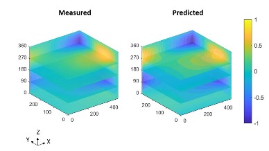
The image shows the normalised out-of-plane displacements as the colour as a function of time in the z-direction for the surface of a panel represented by the xy-plane.

Source:

Amjad KH, Christian WJ, Dvurecenska KS, Mollenhauer D, Przybyla CP, Patterson EA. Quantitative Comparisons of Volumetric Datasets from Experiments and Computational Models. IEEE Access. 11: 123401-123417, 2023.

Predicting release rates of hydrogen from stainless steel

Decorative photograph showing electrolysis cellThe influence of hydrogen on the structural integrity of nuclear power plant, where water molecules in the coolant circuit can be split by electrolysis or radiolysis to produce hydrogen, has been a concern to engineers for decades.  However, plans for a hydrogen economy and commercial fusion reactors, in which plasma-facing structural components will likely be exposed to hydrogen, has accelerated interest in understanding the complex interactions of hydrogen with metals, especially in the presence of irradiation.  A key step in advancing our understanding of these interactions is the measurement and prediction of the uptake and release of hydrogen by key structural materials.  We have recently published a study in Scientific Reports in which we developed a method for predicting the amount hydrogen in a steel under test conditions.  We used a sample of stainless steel as an electrode (cathode) in an electrolysis cell that split water molecules producing hydrogen atoms that were attracted to the steel. After loading the steel with hydrogen in the cell, we measured the rate of release of the hydrogen from the steel over two minutes by monitoring the drop in current in the cell, using a technique called potentiostatic discharge.  We used our measurements to calibrate a model of hydrogen release rate, based on Fick’s second law of diffusion, which relates the rate of hydrogen motion (diffusion) to the surface area perpendicular to the motion and the concentration gradient in the direction of motion.  Finally, we used our calibrated model to predict the release rate of hydrogen over 24 hours and checked our predictions using a second measurement based on the hydrogen released when the steel was melted.  So, now we have a method of predicting the amount of hydrogen in a steel remaining in a sample many hours after exposure during electrolysis without destroying the test sample.  This will allow us to perform better defined tests on the influence of hydrogen on the performance of stainless steel in the extreme environments of fission and fusion reactors.

Source:

Weihrauch M, Patel M, Patterson EA. Measurements and predictions of diffusible hydrogen escape and absorption in cathodically charged 316LN austenitic stainless steel. Scientific Reports. 13(1):10545, 2023.

Image:

Figure 2a from Weihrauch et al , 2023 showing electrolysis cell setup for potentiostatic discharge experiments.

Fairy lights and decomposing multi-dimensional datasets

A time-lapsed series of photographs showing the sun during the day at North Cape in NorwayMany years ago, I had a poster that I bought when I visited North Cape in Norway where in summer the sun never sets.  The poster was a time-series of 24 photographs taken at hourly intervals showing the height of the sun in the sky during a summer day at North Cape, similar to the thumbnail.  We can plot the height of the sun as a function of time of day with time on the horizontal axis and height on the vertical axis to obtain a graph that would be a sine wave, part of which is apparent in the thumbnail.  However, the brightness of the sun also appears to vary during the day and so we could also conceive of a graph where the intensity of a line of symbols represented the height of the sun in the sky.  Like a string of fairy lights in which we can control the brightness of each one individually  – we would have a one-dimensional plot instead of a two-dimensional one.  If we had a flat surface covered with an array of lights – a chessboard with a fairy light in each square – then we could represent three-dimensional data, for instance the distribution of elevation over a field using the intensity of the lights – just as some maps use the intensity of a colour to illustrate elevation.  We can take this concept a couple of stages further to plot four-dimensional data in three-dimensional space, for instance, we could build a three-dimensional stack of transparent cubes each containing a fairy light to plot the variation in moisture content in the soil at depths beneath as well as across the field.  The location of the fairy lights would correspond to the location beneath the ground and their intensity the moisture content.  I chose this example because we recently used data on soil moisture in a river basin in China in our research (see ‘From strain measurements to assessing El Nino events’ on March 17th 2021).  We can carry on adding variables and, for example if the data were available, consider the change in moisture content with time and three-dimensional location beneath the ground – that’s five-dimensional data.  We could change the intensity of the fairy lights with time to show the variation of moisture content with time.  My brain struggles to conceive how to represent six-dimensional data though mathematically it is simple to continue adding dimensions.  It is also challenging to compare datasets with so many variables or dimensions so part of our research has been focussed on elegant methods of making comparisons.  We have been able to reduce maps of data – the chessboard of fairy lights – to a feature vector (a short string of numbers) for some time now [see ‘Recognizing strain’ on October 28th, 2015 and ‘Nudging discoveries along the innovation path’ on October 19th, 2022]; however, very recently we have extended this capability to volumes of data – the stack of transparent cubes with fairy lights in them.  The feature vector is slightly longer but can be used track changes in condition, for instance, in a composite component using computer tomography (CT) data or to validate simulations of stress or possibly fluid flow [see ‘Reliable predictions of non-Newtonian flows of sludge’ on March 29th, 2023].  There is no reason why we cannot extend it further to six or more dimensional data but it is challenging to find an engineering application, at least at the moment.

Photo by PCmarja2006 on Flickr

Reliable predictions of non-Newtonian flows of sludge

Regular readers of this blog will be aware that I have been working for many years on validation processes for computational models of structures employed in a wide range of sectors, including aerospace engineering [see ‘The blind leading the blind’ on May 27th, 2020] and nuclear energy [see ‘Million to one’ on November 21st, 2018].  Validation is determining the extent to which predictions from a model are representative of behaviour in the real-world [see ‘Model validation’ on September 18th, 2012].  More recently, I have been working on model credibility, which is the willingness of people, besides the modeller, to use the predictions from models in decision-making [see, for example, ‘Credible predictions for regulatory decision-making’ on December 9th, 2020].  I have started to consider the complex world of predictive modelling of fluid flow and I am hoping to start a collaboration with a new colleague on the flow of sludges.  Sludges are more common than you might think but we are interested in modelling the flow of waste, both wastewater (sewage) and nuclear wastes.  We have a PhD studentship available sponsored jointly by the GREEN CDT and the National Nuclear Laboratory.  The project is interdisciplinary in two dimensions because it will combine experiments and simulations as well as uniting ideas from solid mechanics and fluid mechanics.  The integration of concepts and technologies across these boundaries brings a level of adventure to the project which will be countered by building on well-established research in solid mechanics on quantitative comparisons of measurements and predictions and by employing current numerical and experimental work on wastewater sludges.  If you are interested or know someone who might want to join our research then you can find out more here.

Image: Sewage sludge disposal in Germany: Andrea Roskosch / UBA