Category Archives: MyResearch

Busman’s holiday

Decorative image of fountain and palm tree
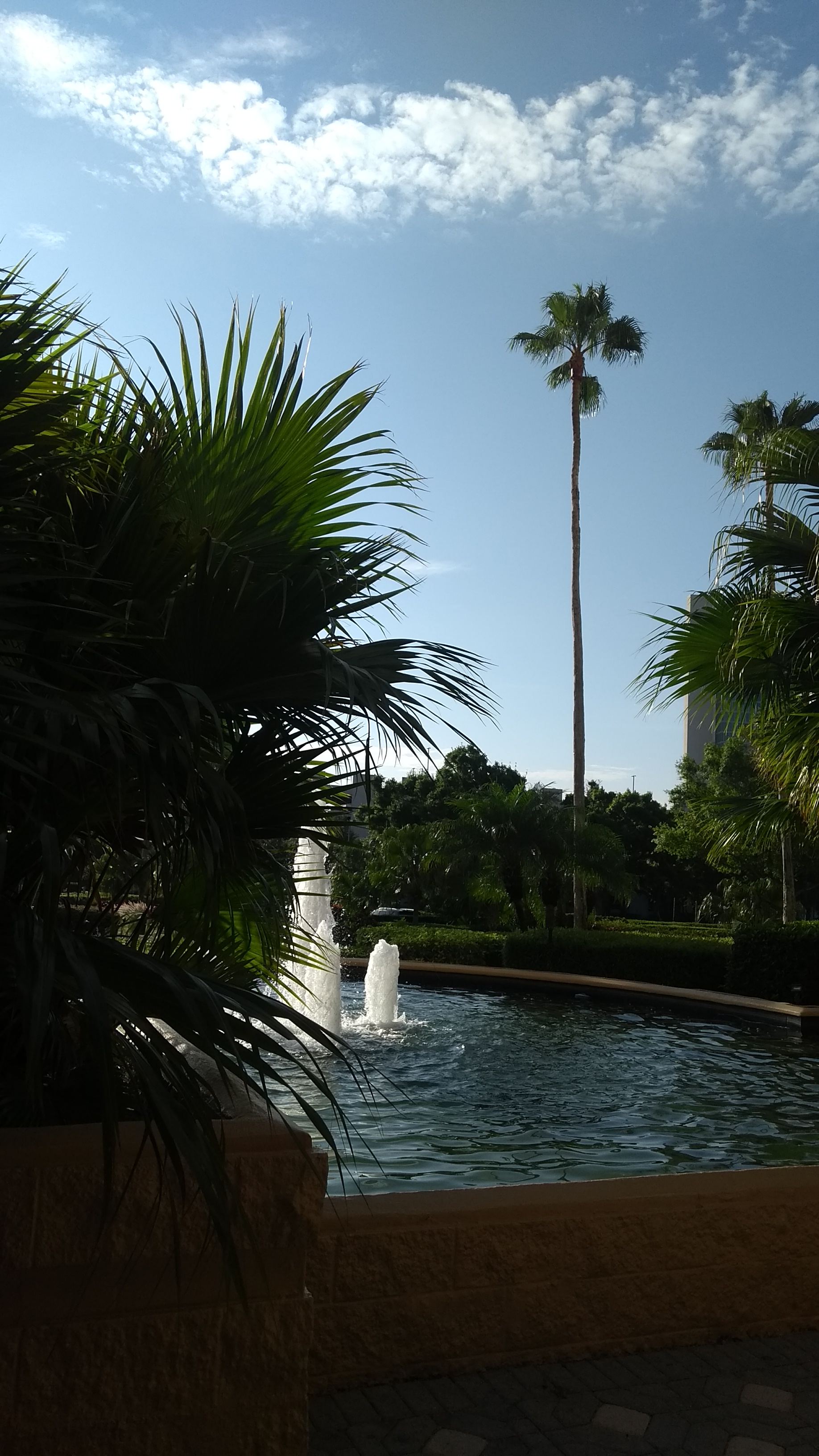
A couple of weeks ago, I travelled to my first international conference following the pandemic lockdowns.  It was stimulating to hear presentations from well-established researchers who I had not seen in person for four or five years and to meet new researchers who had joined our community since 2019.  It was exciting to present our own research to an international audience for the first time and get instant feedback on it.  Of course, it helped that we met in Orlando, Florida.  If a change is as good as a rest then I had a four day rest from my usual work routines.  You could call it a holiday in the sense that a holiday is a day of festivity during which we celebrate in a joyful or exuberant way, according to the dictionary, and I felt we joyfully celebrated our research.  I gave three presentations on our work on low-cost, real-time crack monitoring described in ‘Seeing small changes is a big achievement’ on October 26th, 2022; on additive manufacture of reinforced flat plates (see ‘On flatness and roughness’ on January 19th, 2022); and on a further development of the research described in ‘Less certain predictions’ on August 2nd 2017.  Listening to other speakers caused my own thoughts to wander and I found myself using my phone as a mental prosthetic or expert system [see ‘Thinking out of the skull’ on March 18th, 2015] to provide me with information about definitions, to remind me about previous research, both ours and other people’s, as well as to refresh my memory on previous ideas via this blog [see ‘Amplified intelligence’ on January 4th, 2023].  Susan Greenfield, feared that such devices and activity might lead to formation of smaller neuronal assemblies in the brain and consequential loss of creativity [see ‘Digital hive mind’ on November 30th 2016]; instead, I found myself making faster connections and creating new ideas for future research.  However, I recorded them, as Leonardo di Vinci would have done – in my notebook!  My excuse is that my phone was too busy being an expert system and writing my notes by hand allowed my brain to connect the fragments of ideas and thoughts into some sort of coherency [see ‘Space between the words’ on July 6th, 2022].  Besides writing four posts for this blog in as many days, I have a list of new ideas to accelerate existing projects and start new ones.  So, whilst post-pandemic I will not be returning to business as usual in terms of international travel, a small number of infrequent trips would appear to be worthwhile, especially if our research helps move our economies towards their zero emissions targets.

Image: photograph from entrance to conference hotel.

Fairy lights and decomposing multi-dimensional datasets

A time-lapsed series of photographs showing the sun during the day at North Cape in NorwayMany years ago, I had a poster that I bought when I visited North Cape in Norway where in summer the sun never sets.  The poster was a time-series of 24 photographs taken at hourly intervals showing the height of the sun in the sky during a summer day at North Cape, similar to the thumbnail.  We can plot the height of the sun as a function of time of day with time on the horizontal axis and height on the vertical axis to obtain a graph that would be a sine wave, part of which is apparent in the thumbnail.  However, the brightness of the sun also appears to vary during the day and so we could also conceive of a graph where the intensity of a line of symbols represented the height of the sun in the sky.  Like a string of fairy lights in which we can control the brightness of each one individually  – we would have a one-dimensional plot instead of a two-dimensional one.  If we had a flat surface covered with an array of lights – a chessboard with a fairy light in each square – then we could represent three-dimensional data, for instance the distribution of elevation over a field using the intensity of the lights – just as some maps use the intensity of a colour to illustrate elevation.  We can take this concept a couple of stages further to plot four-dimensional data in three-dimensional space, for instance, we could build a three-dimensional stack of transparent cubes each containing a fairy light to plot the variation in moisture content in the soil at depths beneath as well as across the field.  The location of the fairy lights would correspond to the location beneath the ground and their intensity the moisture content.  I chose this example because we recently used data on soil moisture in a river basin in China in our research (see ‘From strain measurements to assessing El Nino events’ on March 17th 2021).  We can carry on adding variables and, for example if the data were available, consider the change in moisture content with time and three-dimensional location beneath the ground – that’s five-dimensional data.  We could change the intensity of the fairy lights with time to show the variation of moisture content with time.  My brain struggles to conceive how to represent six-dimensional data though mathematically it is simple to continue adding dimensions.  It is also challenging to compare datasets with so many variables or dimensions so part of our research has been focussed on elegant methods of making comparisons.  We have been able to reduce maps of data – the chessboard of fairy lights – to a feature vector (a short string of numbers) for some time now [see ‘Recognizing strain’ on October 28th, 2015 and ‘Nudging discoveries along the innovation path’ on October 19th, 2022]; however, very recently we have extended this capability to volumes of data – the stack of transparent cubes with fairy lights in them.  The feature vector is slightly longer but can be used track changes in condition, for instance, in a composite component using computer tomography (CT) data or to validate simulations of stress or possibly fluid flow [see ‘Reliable predictions of non-Newtonian flows of sludge’ on March 29th, 2023].  There is no reason why we cannot extend it further to six or more dimensional data but it is challenging to find an engineering application, at least at the moment.

Photo by PCmarja2006 on Flickr

How many engineers do you need when the lights go out?

An exemplar adverse outcome pathway for microplastics in aquatic species

From Galloway & Lewis, 2016

One to change the lightbulb and five to perform a Fault Tree Analysis (FTA).  A fault tree is a diagram that illustrates the relationship between failures at component and system levels.  Engineers use them to understand the mechanisms or logic that lead from component malfunctions to system breakdowns and to identify components that are critical to system reliability.  They are useful in optimizing designs, demonstrating compliance with safety requirements and as diagnostic tools when things go wrong.  There are some simple examples of fault trees for ‘no light in room’ and ‘missing the bus’ amongst others available from Visual Paradigm Online.  All of these examples illustrate qualitative relationships but we can also establish quantitative relationships using the rate of occurrence of each initiating event to arrive at a probability of failure (PoF) for the system.  There is an example for an indicator light in an automobile in a 2016 paper by Nabarun Das and William Taylor (see figure 2 in the paper).  An equivalent in biology are Adverse Outcome Pathways (AOPs) that identify the relationship between a molecular initiating event and a toxic effect through a series of key events.  For instance, microplastics causing altered gene expression and oxidative damage leading to altered fatty acid metabolism, stress response and altered cellular division resulting ultimately in population decline in aquatic species as shown in the graphic from a paper by Tamara Galloway and Ceri Lewis also published in 2016. Most AOPs are qualitative; however, quantitative Adverse Outcome Pathways (qAOPs) are starting to be developed as tools for quantitative risk assessment of chemicals.  Biologists and engineers are not using the same words, actually they are using entirely different vocabularies; nevertheless they are talking about the same methodologies.  An AOP network and an FTA are essentially the same concept and a probabilistic fault tree analysis is a quantitative adverse outcome pathway.  However, it seems unlikely that either biologists or engineers will adopt the language used by the other so they will be reliant on a few foolhardy interlocutors prepared to cross the discipline boundaries and highlight the opportunities for cross-fertilization of ideas and solutions.

Sources

Das N, Taylor W. Quantified fault tree techniques for calculating hardware fault metrics according to ISO 26262. In2016 IEEE Symposium on Product Compliance Engineering (ISPCE), pp. 1-8. IEEE, 2016. Also available at https://incompliancemag.com/article/quantified-fault-tree-techniques-for-calculating-hardware-fault-metrics-according-to-iso-26262/

Galloway TS, Lewis CN. Marine microplastics spell big problems for future generations. Proceedings of the national academy of sciences. 113(9):2331-3, 2016.

Slicing the cake equally or engineering justice

Decorative photograph of sliced chocolate cakeIn support of the research being performed by one of the PhD students that I am supervising, I have been reading about ‘energy justice’.  Energy justice involves the equitable sharing of the benefits and burdens of the production and consumption of energy, including the fair treatment of individuals and communities when making decisions about energy.  At the moment our research is focussed on the sharing of the burdens associated with energy production and ways in which digital technology might improve decision-making processes.  Justice incorporates the distribution of rights, liberties, power, opportunities, and money – sometimes known as ‘primary goods’.  The theory of justice proposed by the American philosopher, John Rawls in the 1970’s is a recurring theme: that these primary goods should be distributed in a manner a hypothetical person would choose, if, at the time, they were ignorant of their own status in society.  In my family, this is the principle we use to divide cakes and other goodies equally between us, i.e., the person slicing the cake is the last person to take a slice.  While many in society overlook the inequalities and injustices that sustain their privileged positions, I believe that engineers have a professional responsibility to work towards the equitable distribution of the benefits and burdens of engineering on the individuals and communities, i.e., ‘engineering justice’ [see ‘Where science meets society‘ on September 2nd, 2015].  This likely involves creating a more diverse engineering profession which is better equipped to generate engineering solutions that address the needs of the whole of our global society [see ‘Re-engineering engineering‘ on August 30th, 2017].  However, it also requires us to rethink our decision-making processes to achieve  ‘engineering justice’.  There is a clear and close link to ‘procedure justice’ and ‘fair process’ [see ‘Advice to abbots and other leaders‘ November 13th, 2019] which involves listening to people, making a decision, then explaining the decision to everyone concerned.  In our research, we are interested in how digital environments, including digital twins and industrial metaverses, might enable wider and more informed involvement in decision-making about major engineering infrastructure projects, with energy as our starting point.

Sources:

Derbyshire J, Justice, fairness and why Rawls still matters today, FT Weekend, April 20th, 2023.

MacGregor N, How to transcend the culture wars, FT Weekend, April 29/30th, 2023.

Rawls J, A Theory of Justice, Cambridge MA: Belknap Press, 1971

Sovacool BK & Dworkin MH, Global Energy Justice: Problems, Principles and Practices, Cambridge: Cambridge University Press, 2014.

Image: https://www.alsothecrumbsplease.com/air-fryer-chocolate-cake/